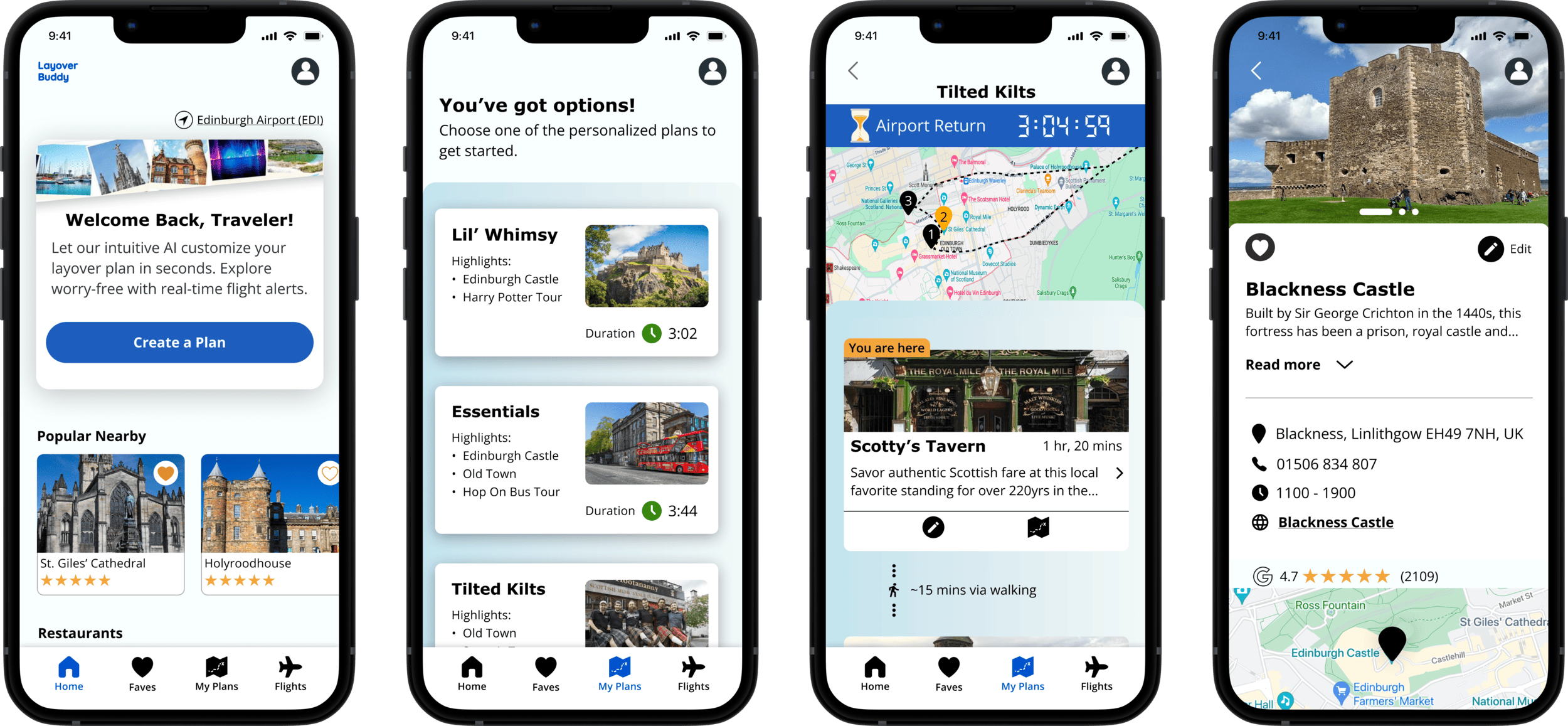
Layover Buddy curates tailored itineraries, making exploration easy and enjoyable. It's like having a travel companion that understands your preferences, turning every layover into a personalized experience.
The Federal Aviation Administration (FAA) manages ~10 million flights in the U.S. every year. A significant 20% of those have experienced delays or cancellations so far in 2023. Disruptions, due to reduced plane turnarounds, staffing shortages, and weather lead to more travelers experiencing unexpected layovers.
In today's travel landscape, where the journey is becoming the focus rather than just the destination, these delays present an opportunity to transform a stressful situation into a memorable experience.
Overview
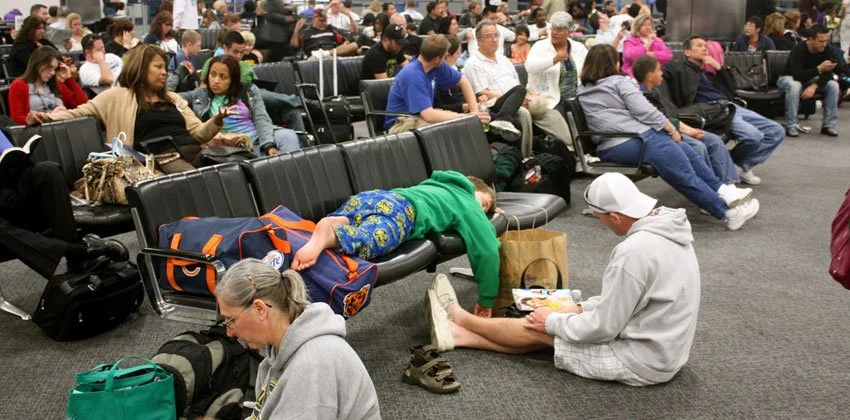
Facing travel disruptions causes travelers stress and uncertainty, long boring sits in airports, and missed opportunities for travelers; diminishing their overall travel experience.
The Problem
Layover Buddy, an end-to-end application empowering users to transform their unplanned delays into memorable experiences.
The Solution
My Process
RESEARCH
Establishing a Research Plan and Goals:
To kick things off, I first created my research plan. This helped me clearly establish my top research goals:
Gain insights into the travel patterns, behaviors, and specific needs of individuals who have experienced short layovers, whether planned or unexpected.
Learn what types of experiences or services such travelers have explored or would appreciate to optimize future layover stays.
Understanding the Market: Competitor Research
I began by conducting extensive market research to understand what resources currently exist for travelers facing unexpected layovers.
While there are hundreds of apps designed for travelers, my primary research identified a notable gap in the market. There appeared to be no direct competitors offering specialized solutions for travelers facing a layover. This finding underscored a potential opportunity for a service like 'Layover Buddy' and it’s unique value proposition.
Below, I have highlighted the nearest indirect competitors and a brief description of their services.
Screener Survey to Recruit
To optimize the efficiency of my interview process, I chose to create a screener survey using Google Forms. This quick tool allowed me to engage with a diverse range of participants, while also filtering for individuals with experiences closely aligned with the app's purpose, such as frequent travelers and those who have encountered layovers.
User Interviews
Reading the results from my survey, I crafted an interview guide and scheduled user interviews.
I was able to conduct 6 in-depth interviews within my time constraints. I conducted these interviews via Google Meet and Zoom and used a transcribing service to ensure I didn’t miss or forget anything that was shared. Below are a few of my participants who agreed to be photographed.
DEFINE
Important Insights Derived from Research:
Time management is a top concern for all interviewees, with a focus on not missing connecting flights.
Modern travelers, especially the younger generation, prioritize journey experiences over simply reaching their destination.
Business travelers will often try to remember specific spots in the cities they visit during work trips for future exploration.
Some travelers intentionally plan extended layovers to explore cities, essentially adding a stop to their itinerary.
Focus on Users: Empathy Mapping
I created an empathy map to pinpoint user needs and motivations, this tool helped me ensure I was steering clear of personal assumptions from my 8 years of working in the airline industry. By identifying the pains and gains of potential users, I could effectively prioritize features for the MVP.
Developing Two Divergent User Personas
My research had uncovered two primary traveler categories: those deliberately planning extended layovers and those facing unexpected layovers. To effectively address both scenarios, I developed two distinct user personas. These personas would serve as a guide in molding the app's design, fostering solutions for each type of traveler.
IDEATE
Feature Prioritization
I created a list of all the features I envisioned that the complete app would have.
Then I reviewed my research and interview insights to help me place each feature into a category of importance for the MVP. This prioritization ensures that the MVP addresses core user needs and also lays the foundation for a feature-rich app that can evolve in response to user feedback and emerging trends.
App Architecture
Guided by users' objectives, I began laying out how to best design the navigation. Utilizing a bottom navigation bar, I set out to categorize the screens in a way that aligned with user expectations and required minimal cognitive load. The ultimate goal was to make the navigation and information feel intuitive.
Spoiler Alert: The final navigation design is quite different!
Using Task Flows to Guide
Next, I began laying out key flows to help me better visualize what types of screens and actions would be involved in the design. I initially created multiple very detailed task flows for the app, but found them to be too expansive given my constraints.
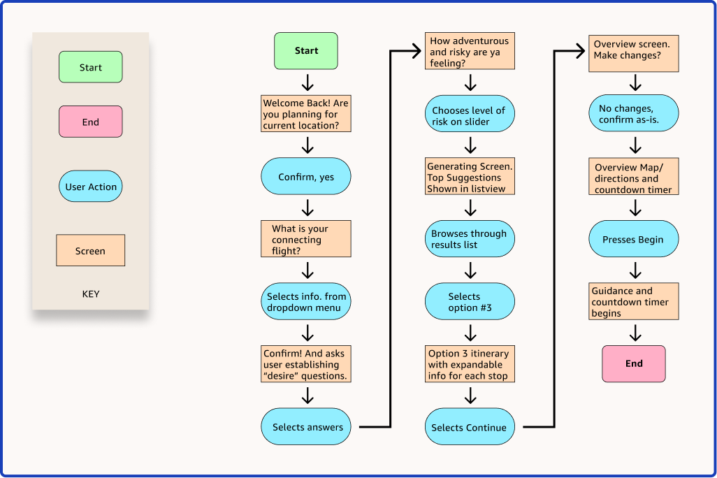
So, I chose to highlight a single task flow that emphasizes the app's key feature – an AI-generated layover plan based on user input and their layover length.
Visualizing Layout with Quick Sketches
Now for some ideating with a pencil and paper! I quickly drew up some low-fidelity sketches to explore different versions for key screens. These initial sketches served as a quick and easy method for visualizing layouts and structure of the design before moving to Figma for more refined digital versions.
DESIGN & TEST
Mid-fidelity Wireframes
These digital wireframes underwent a lot of iterations as real content was added and I conducted initial testing. Given the users' limited time, creating the plan should feel efficient yet personalized. Progressive disclosure unveils information and screens as needed, keeping users engaged and preventing frustration.
Branding: A Palette of Trust and Adventure
For the color palette, blue was chosen to convey trust and reliability, instilling a sense of security for layover travelers. This aligns with the app's purpose of providing a reliable companion during potentially stressful situations. Orange adds energy and enthusiasm, symbolizing the joy of exploration. The choice of a simple sans-serif font ensures easy readability on mobile devices.
High-fidelity Screens
Now I moved on to refining everything as high fidelity screens. My process involved implementing UI elements, typography, copy and color choices. Some selections naturally changed and evolved as I aimed for a cohesive and functional user experience and received feedback from fellow designers in critique sessions.
Reassessing App’s Navigation with Quick Preference testing
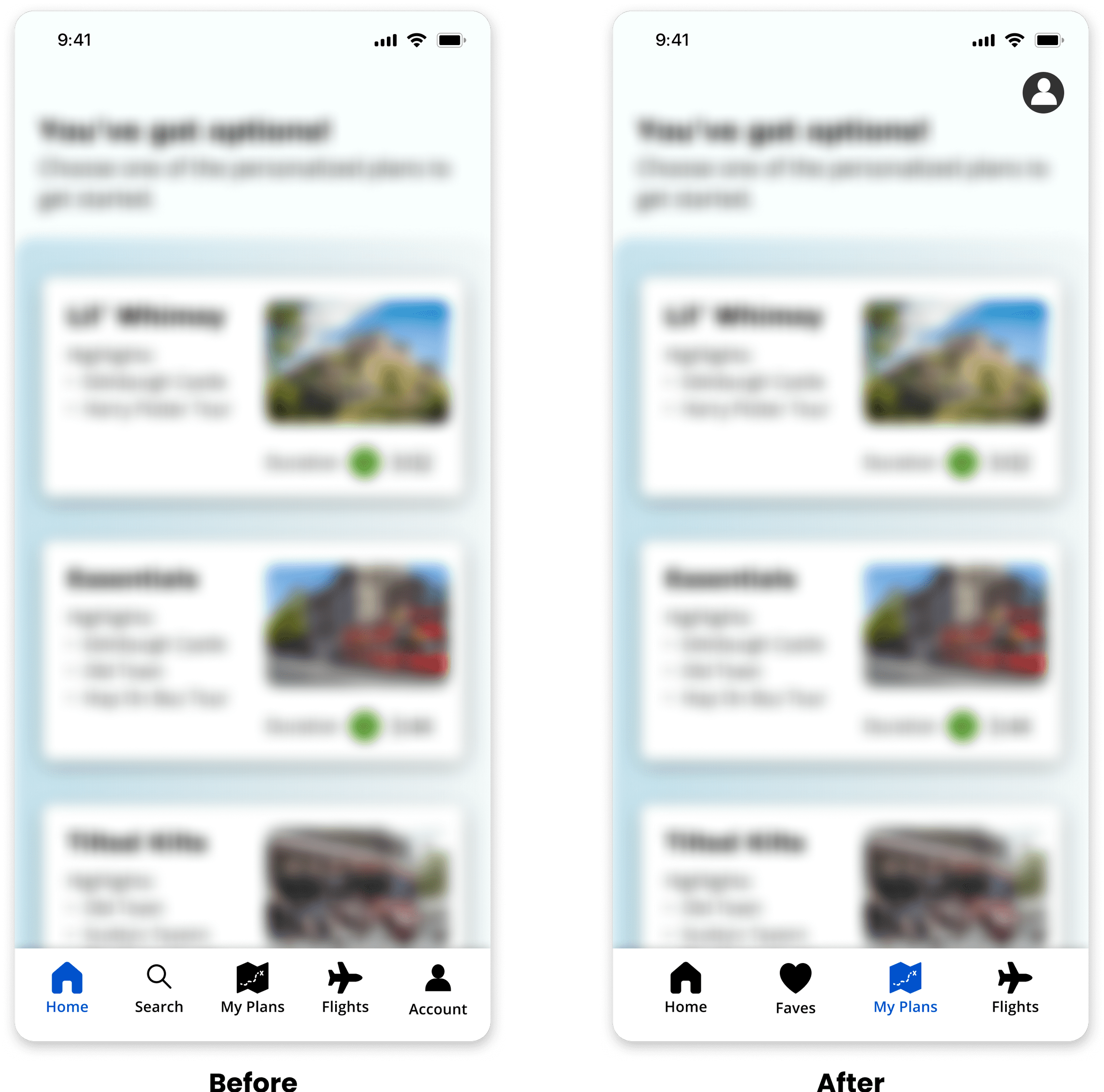
Now, I began to scrutinize the bottom navigation bar and the layout decisions I had made regarding the app’s architecture. Based on my interviews, I knew users wanted to save favorite locations easily when traveling. I also came to realize that a dedicated search icon in the nav bar was not necessary. I remedied these issues by replacing the Search icon with a Faves icon in the bottom nav bar.
But, one more issue nagged me, Would users want to access their account information from the bottom nav bar as I had assumed? Seeing many other travel apps placed the profile icon on the top bar, I was prompted to perform a quick preference test. I mocked up two identical screens - the only difference being the placement of the profile icon. I then showed the screens to 8 potential users and found that 7 out of the 8 users, preferred the profile icon located on the top right! This revelation caused me to reposition the profile icon to the top right.
The result, a more intuitive experience and more focused navigation.
Prototype Testing
I conducted both moderated and unmoderated usability testing with a total of 21 participants. Most of these tests were done through the testing platform Maze, a few were conducted on with the prototype in Figma, and one was completed on a mobile device. I gained many valuable insights from the testing, as well as feedback from my peers in group critique.
User Tasks:
To assess the functionality of the MVP features, testers were asked to:
Input preferences and create a new layover plan
Modify their plan by removing a specified destination
Filter and view their favorited destinations
ITERATE
Analyzing Test Results
Most tasks were easy for users to complete, with definite room for improvement to simplify the design and improve a few of the visual elements for clarity. Looking at all feedback, I created an Impact–Effort Matrix and to evaluate which were the most important. Then I charted the improvements to be implemented immediately, given my constraints.
Revisions
In all, there were 7 total revisions made to arrive at the final product. Below I have highlighted the most critical 3 of those changes.
Layover Buddy: The MVP
TAKEAWAYS
Organized note-taking in Figma streamlined updates
Simplifying how I handled element updates in the first half of the project made a big difference. Initially I was tweaking elements here and there as I went, but this was consuming too much time. So, I started jotting down my ideas for changes in a sentence or two within my Figma file. Before testing, I reviewed these notes and made one final adjustment to the elements I wanted to finesse - instead of several small changes along the way. This approach saved time, allowing me to consider and edit my ideas in one go.
Thank you for reading!

