A mobile-first platform designed to enhance the organizing and planning of camping trips with friends.
CampWise
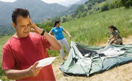
Witnessing my friends struggle to plan a group camping getaway, I was inspired to explore the camping industry. In the post-pandemic era, where reconnecting with friends and embracing outdoor activities has become a top priority, there exists significant opportunity.
Background
The Problem
Planning a group camping trip can be challenging for occasional campers. Existing platforms lack all the necessary features for collaborative planning, forcing users to rely on multiple resources. This can lead to stress, and poorly executed camping adventures.
The Goal
Create and design a system that consolidates and combines calendars, packing checklists, and reservations, enabling friends to easily communicate and plan for their trip conveniently all in one place.
Empathize Define Ideate Prototype Test
It always begins with Research
I wanted to learn as much as possible about the camping industry so I began compiling information from some basic internet searches. Performing this secondary research gave me a much better understanding of the camping industry and great insights into emerging trends and expectations. Not surprisingly, the industry underwent exponential expansion during the pandemic, thereby fostering a more diverse range of participants in the activity. With more people now interested in camping, it seems likely there exists potential for new platforms.
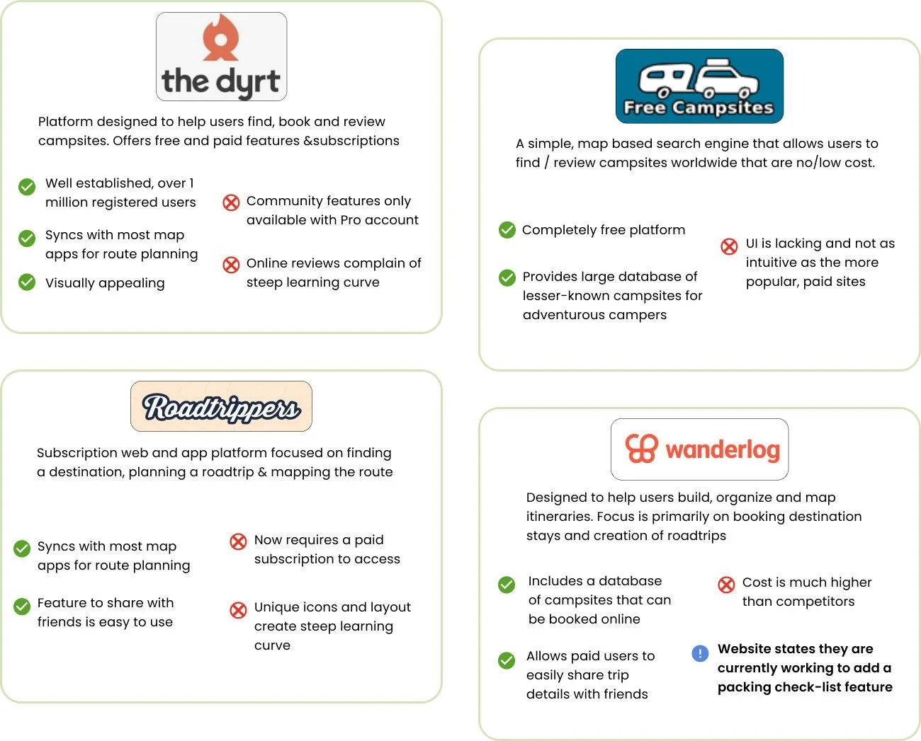
Competitive Analysis
To complement the initial market research, I completed a competitive analysis of some direct and indirect competitors to identify their strengths, weaknesses and any existing gaps within the market.
Survey, says!
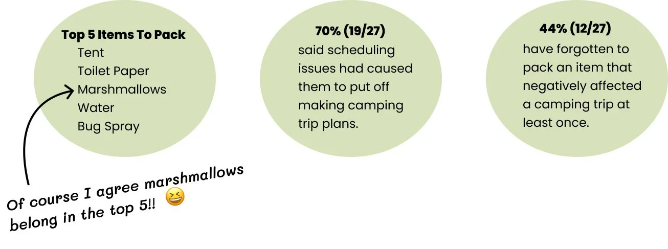
Creating a survey using Google Forms, I surveyed people who had some camping experience. I received (27) total responses which gave me a good start and highlighted some commonly shared motivations, pain points, camping habits and goals.
Conducting Interviews
Next, I conducted user interviews to empathize with campers and understand their needs when planning a camping trip. These interviews were instrumental and gave me thorough insights into the problems I needed to tackle in my design.
I conducted a total of (7) user interviews. Five interviews were conducted remotely via Zoom or FB Messenger and two were conducted in person. I prepared 20 interview questions and included follow up questions as needed during the sessions. Using Tactiq.io to transcribe the sessions was super helpful and allowed me to go back and revisit exactly what the users had said in their own words.
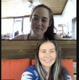
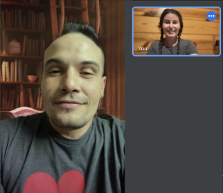
Pictured below are 2 interviewees who agreed to be photographed for my case study. (Thanks guys!)
Empathize Define Ideate Prototype Test
Understanding Insights: Interview Analysis
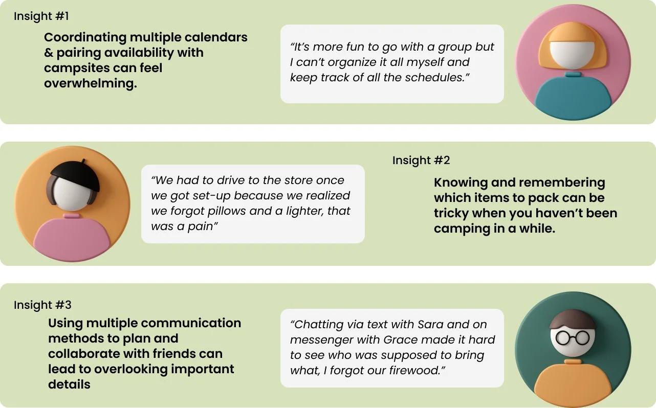
Compiling all the data from the 1-on-1 interviews and survey responses, I used a whiteboard and post-its to affinity map - I could now spot common pain points, emerging trends and patterns. Here I’ve listed 3 of the top insights gathered.
User Personas
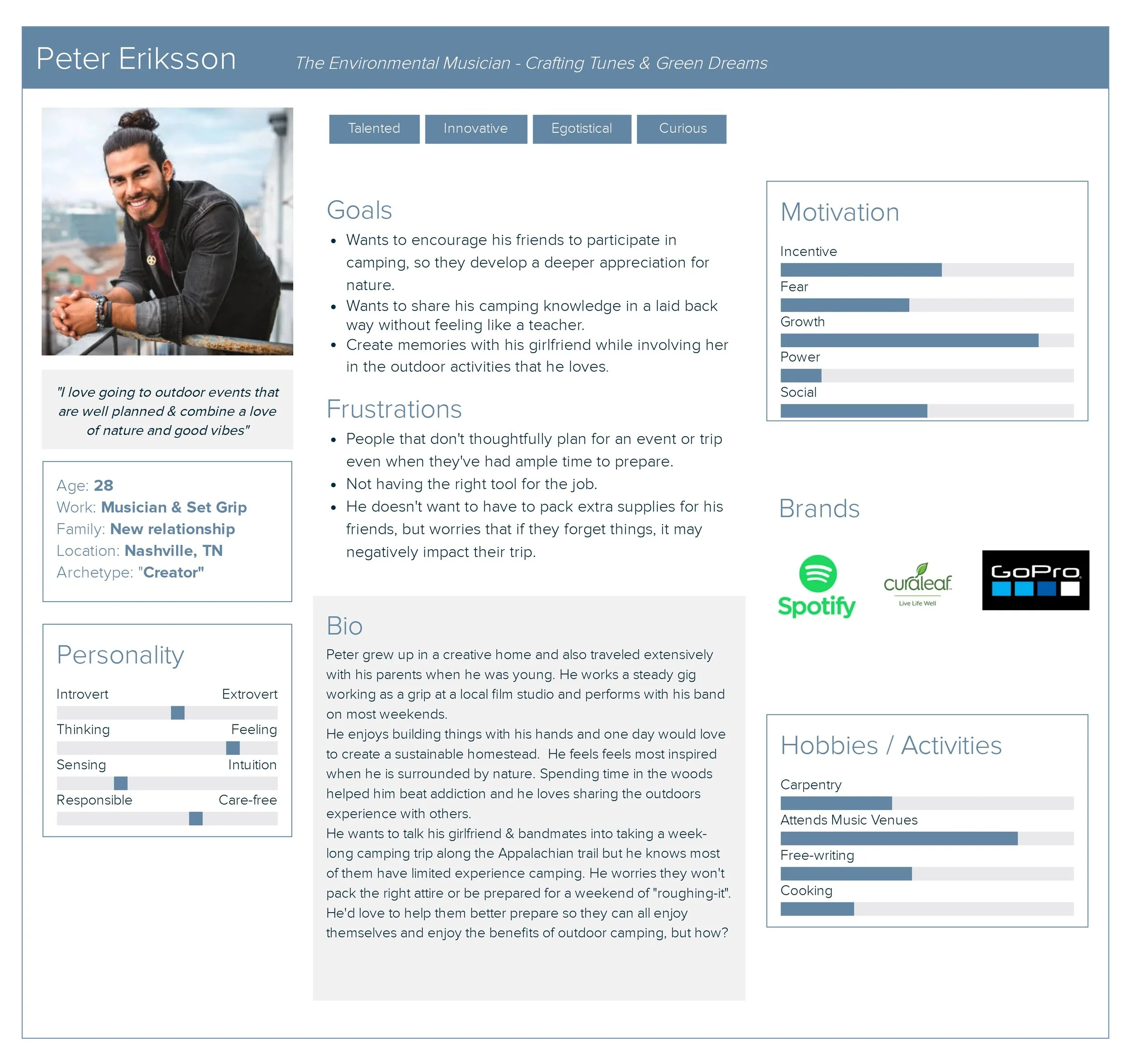
Taking all of my findings into account, I crafted 2 user personas to represent the target users. Throughout the project, the personas served as a valuable tool to validate whether my design decisions were in harmony with the users' needs.
How Might We streamline the camping preparation process, to help campers easily coordinate and pack for a more hassle-free and enjoyable camping experience?
Empathize Define Ideate Prototype Test
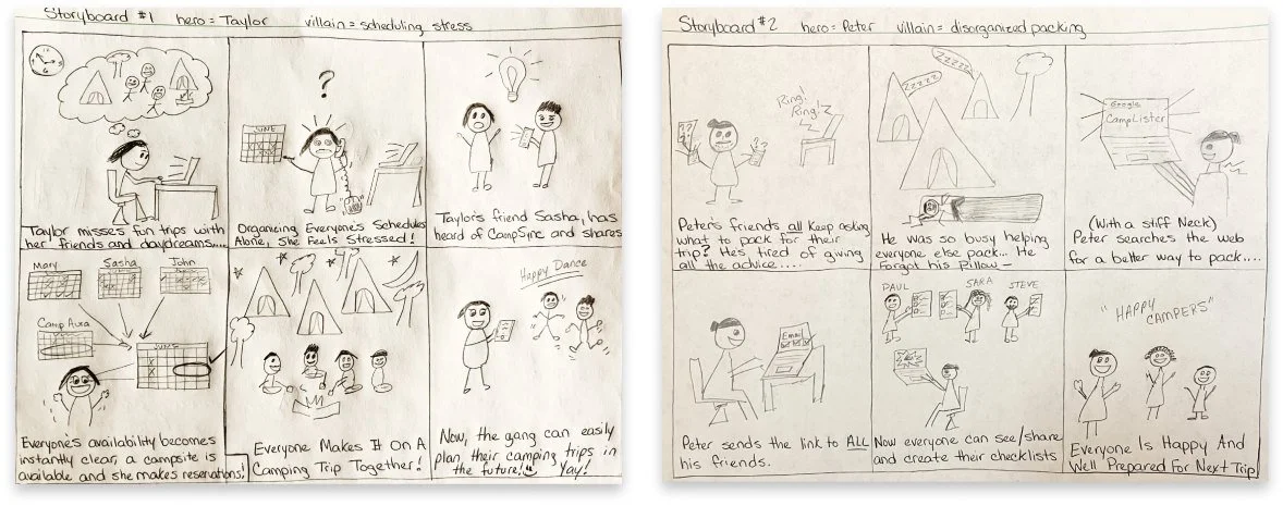
Ideating with Quick-Sketch Storyboards
Reading though the insights and data I’d collected so far got me thinking specifically about WHAT the users will want to accomplish on the CampWise website.
WHEN and WHERE will they use it? What features should be included to ensure their experiences feel seamless and successful?
Information Architecture
Task flows and User flows were devised to validate user interactions and test the user flows for the MVP. I presented my flows in design critiques - this was pivotal to gain fresh insights beyond the happy paths I had already envisioned. Because of feedback I received from other designers, I made tweaks to the flows that I would later use in my testing.
User flow below shows the “Happy Path” a user would take to create and share a new checklist.
Wireframes Take Shape: Low Fidelity Sketches
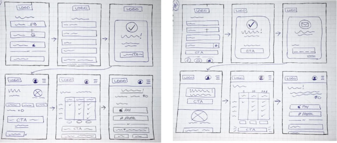
Next it was time to see how this could all lay out on a screen. I sketched several low fidelity wireframes. I reviewed different versions of these screens and shared them in design crit sessions for feedback to help guide my decisions.
These wireframes show the user’s “Happy Path” to create and share a new packing checklist for an upcoming camping trip.
Branding: Logo Design
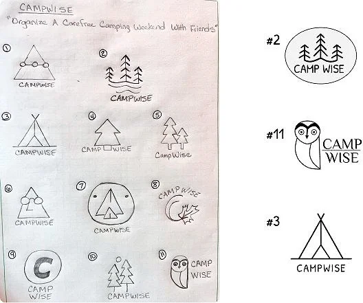
To craft the brand's logo, I drew inspiration from both nature's elements and well-established brands within the camping industry. My aim was to communicate CampWise's simple and friendly aesthetic, while ensuring a distinctive and enduring visual identity that resonated uniquely with users.
Receiving feedback from fellow designers in design crits, I narrowed down the top 3 contenders for the CampWise logo.
Visual Design with Color and Typography
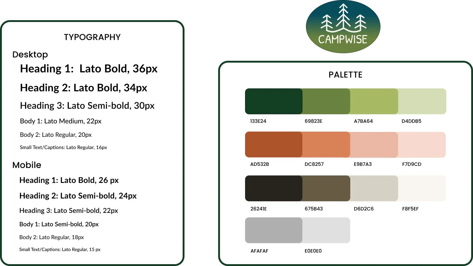
I chose green as the primary color for the palette as it is generally perceived as a positive color, associated with nature, peace and optimism. The secondary and accent colors align with organic, sustainable values often associated with camping and outdoor activities.
I selected the "Lato" font to serve as the cornerstone of the website’s typography. Its balanced proportions and wide range of weights effectively facilitate hierarchy and consistency, while contributing to an inviting and user-friendly design that reflects CampWise's ethos of accessible exploration.
Empathize Define Ideate Prototype Test
UI Kit Customized Icons
While developing the Design System, I chose to utilize an existing set of icons to streamline efficiency and save time. As I considered the distinctive actions and features users would encounter, I saw value in creating several icons from scratch. The unique new icons contribute to the product's visual branding while also ensuring a tailored representation of key functionalities.
Mid-Fidelity
Now that I’d sketched possible designs in the low-fidelity wireframes, I was ready to digitize! Using Figma, I created mid-fidelity wireframes to explore how layouts would appear on a variety of screen sizes. It was important to consider desktop, tablet and mobile sizes to ensure the site would look and feel consistent on any device.
Putting It All Together: A High Fidelity Prototype
Watching ideas and flows turn into a working prototype felt really rewarding, marking a crucial connection between design ideas and practical use. Next, to get ready for the testing phase to gather essential feedback that will enhance and fine-tune the user experience.
Empathize Define Ideate Prototype Test
Conducting Usability Testing
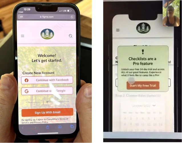
I conducted moderated usability testing with 5 participants. I knew I wanted to use moderated testing to ensure I captured the participant’s non-verbal cues as well as what they said and what clicks and taps they performed. (2) of the tests were done in person while (3) were completed remotely via live calls.
4 Tasks Were Tested:
(1) Create a new account
(2) Navigate to checklists screen
(3) Sign up for free trial
(4) Create & share a checklist
All testers were able to successfully complete all tasks.
*9.1 Ease of Use Rating
Sorting Test Results
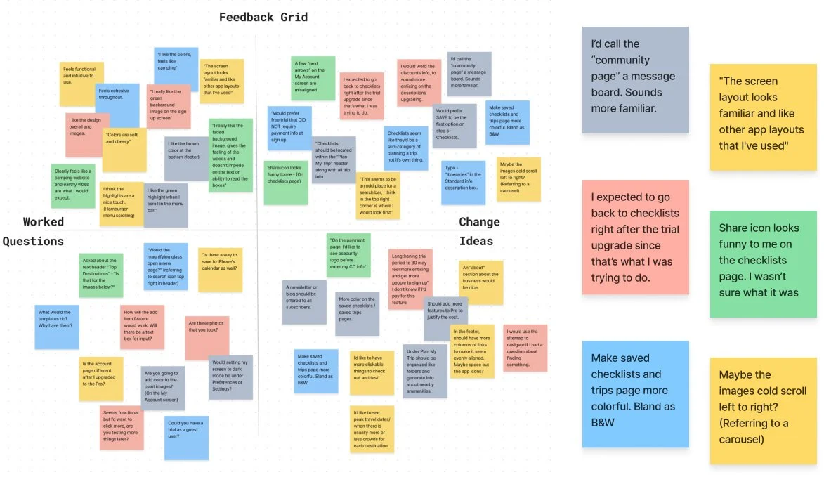
After the usability testing, I created a Feedback grid (pictured below) and a Frequency to Severity Map. This helped me to pinpoint what had worked well, what features needed tweaking, some possible ideas to consider and questions that users asked during the testing.
Key Changes Made:
Changed “Top Destinations” to a horizontal carousel to better align with user mental models.
Changed “Templates” to “Shared Lists” to reduce confusion for user.
Corrected the discovered alignment issues.
Enlarged the trip card and added a splash of color to improve visual consistency and readability.
Introducing CampWise
After reviewing the notes taken during the usability testing and my frequency to severity mapping, I applied the most important changes, arriving at the final product. Click below to watch a quick video demonstration.
Takeaways & Lessons Learned
You can’t solve everything all at once - even though you want to
Reflecting back, I recognize the value of prioritizing and narrowing my focus. Instead of attempting to tackle two problems within the user journey simultaneously, I could have benefitted from dedicating more attention to developing the comprehensive packing checklists or implementing the collaborative communication feature.Trust the process and get feedback early and often
There were several hiccups and flow corrections I had to make along the way. These could have been handled at the lower fidelity stages and saved myself some time and work. Checking in with users and asking for feedback early on in the design process, rather than after I’ve spent time developing a feature, could save time and ensure that what I’m building is what users need.
Thank you for reading!


